 |
1.12 |
|
1.12 |
This chapter discusses how to to use colors, palettes, and themes.
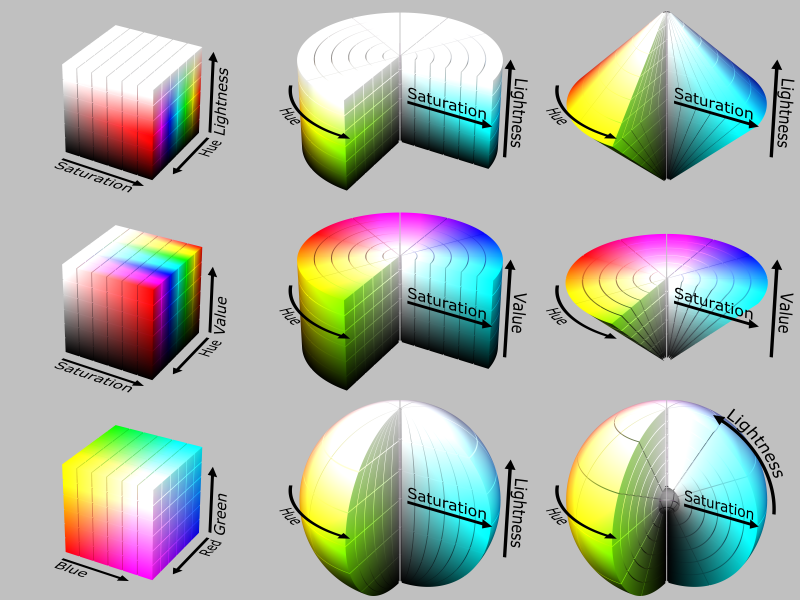
The egt::Color class internally keeps track of a 32-bit RGBA (red, green, blue, and alpha) color by managing the individual color components. However, this class also supports at least the HSV and HSL color spaces, and conversion between the different color spaces. The egt::Pattern class helps with managing a pattern consisting of color steps at specific offsets. Also, the egt::v1::experimental::ColorMap class deals with color steps and allows interpolation between the different color steps in any of the supported color spaces.
Supporting different color spaces provides a variety of different ways to perform interpolation between colors.
The Palette contains a list of Predefined Colors.
The Palette class manages a set of colors. However, colors are not stored as a one dimensional list internally. Colors are identified by an egt::v1::Palette::ColorId and also an egt::v1::Palette::GroupId. The GroupId is associated with different states of a color in the palette, which corresponds with different states of a widget. For example, when a button is pressed, it changes from a normal to active state and uses the same egt::v1::Palette::ColorId to identify its background color, but uses a different egt::v1::Palette::GroupId.
The default palette for every widget comes from the theme. However, you can override any individual color for a specific widget instance by calling egt::v1::Widget::color().
For a list of configurable palette colors, see Palette::ColorId.
If you change the global theme, it will retroactively have an effect on any widget, as long as that widget does not have an override for a egt::v1::Palette::ColorId and egt::v1::Palette::GroupId set.
The Palette class also defines a set of default colors to reference and use. With a few minor exceptions, these are the same colors defined by the CSS standard.
The theme contains the default palette and font, and also can be used as a place to override egt::v1::Widget::draw() methods.
By default, themes are inherited in the widget hierarchy. If the top level window does not have a custom theme or a widget does not have a parent, it will use egt::global_theme() by default. So, when you add a button widget to a window, that button will use the theme from the window and on up the widget hierarchy as needed. This means if you change the font of the window theme, the button and all of its children will inherit that change. Each Widget can hold its own instance of a theme, set with egt::v1::Widget::theme().
EGT does not use native style widgets by default. It defines the look and feel of its own widgets, which is customizable. The look and feel of widgets can be extended or modified in several ways.
Theme is a class that holds a palette, font, and other functions and properties used by widgets. By default, there is a global_theme() that is used by all widgets. This can be changed by calling the set_global_theme() function.
Each widget references a theme through its egt::v1::Widget::theme() call. However, themes are inherited by default from a widget's parent. If no parent widget has a theme, the egt::global_theme() is used by default.
To break the inheritance, call egt::v1::Widget::theme(). This will cause the widget to maintain its own theme and not inherit from its parent or the global theme. So, if you change the theme for a window, all of its child widgets will inherit that theme by default unless you call egt::v1::Widget::theme() on one of the children.
Inheritance of the theme provides a natural and flexible way to manage the look of widgets with less code.
Each widget type has a default_draw() function that implements the EGT default drawing method for the widget type. This function provides an example of how you would implement your own draw function to customize the look of a widget.
It is possible to change the egt::v1::Widget::draw() function for a widget type globally based only on the widget's C++ type. For example, you can change the draw() function for all Button widgets by setting one draw method.
It is currently not possible to change the draw() function for a specific instance of a widget. To accomplish this task, you must inherit from the widget type you wish to change and overload the draw() function. Then, use the new widget type.
© Copyright 2020 Microchip Technology Inc. All rights reserved.